
This past summer, I joined Lynkr as a design intern, where I led the startup’s full rebrand as it transitioned to Live Time. The goal of the rebrand was to modernize the app’s appearance while preserving the playful spirit of the original design. I developed the new brand identity, built a comprehensive design system, and applied it across the entire app experience. This included creating a brand book that defined Live Time’s visual direction, detailing the new color palette, typography, and logo.
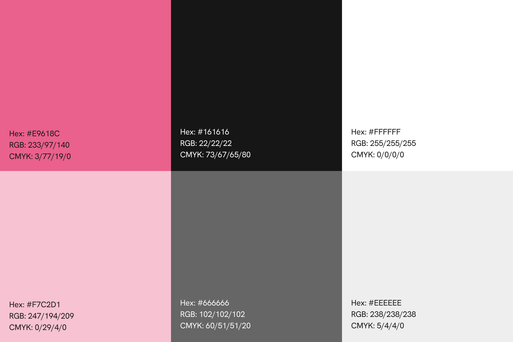
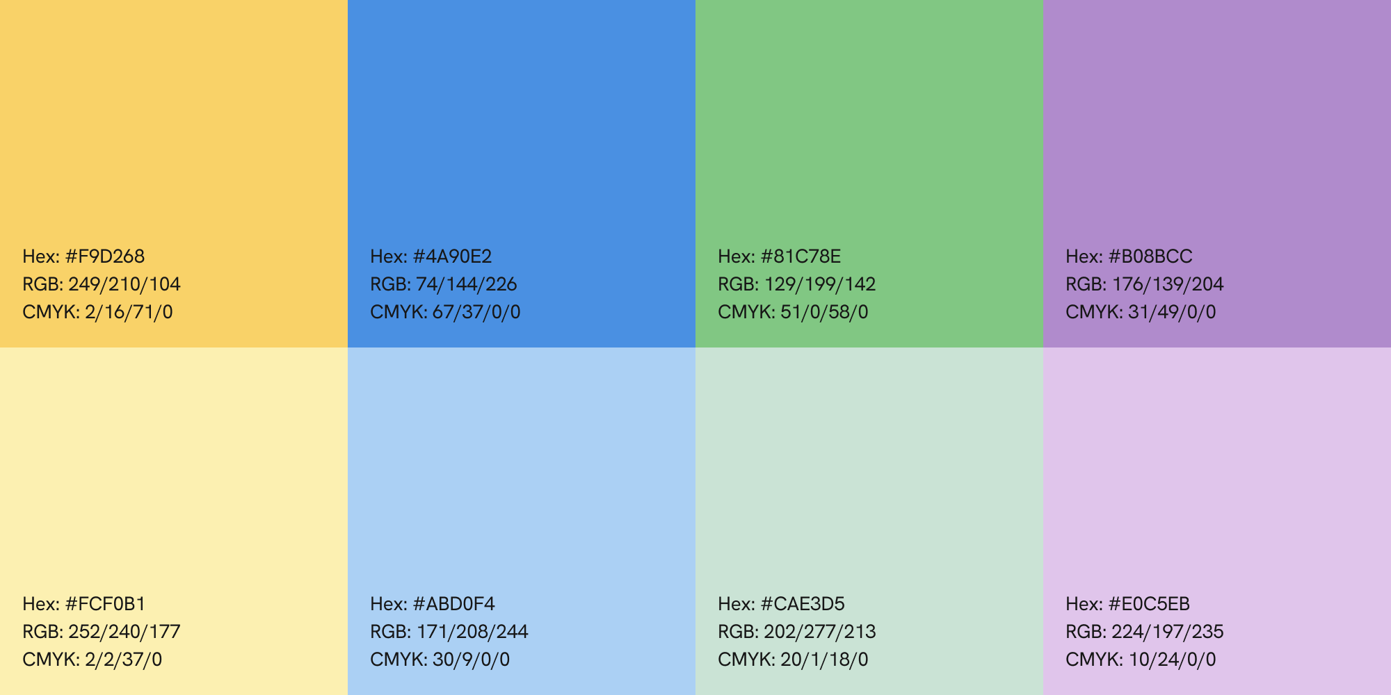
Pink was Lynkr’s primary brand color, used throughout the original app. However, user feedback revealed that the original shade made the app feel “too girly.” Since pink is a distinctive color rarely used in branding, I felt retaining it in the rebrand would help Live Time stand out. To address user concerns, I refined the pink to a shade that felt more modern and gender-neutral, pairing it with black and white to establish Live Time’s primary colors. These colors were tested with accessibility checkers to ensure readability for all users. To add tonal variety, I introduced a lighter shade of pink and two complementary grays. After finalizing the primary palette, I developed five secondary colors and their lighter variations to provide greater flexibility across the app’s design.

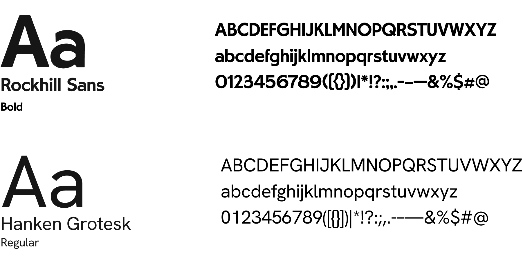
The rebrand introduced two new fonts. To maintain a sleek yet playful feel, I selected Rockhill Sans as the display font since it is both clean and modern while still full of personality. This font is primarily used for branding and display text within the app. For readability, I chose Hanken Grotesk as the primary font for all key information, ensuring the app remains clear and easy to navigate.
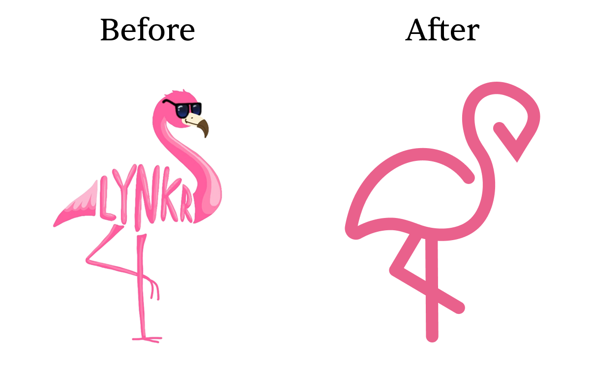
The flamingo logo was retained but redesigned to align with the new modern look. The redesign, first sketched on paper and then refined in Adobe Illustrator, uses clean, simple lines to make the logo easier to recognize and even draw from memory. The redesign is highly versatile, allowing the logo to be seamlessly incorporated into a text-based version.
Below is a before and after comparison:

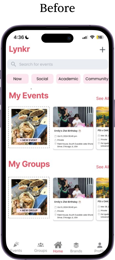
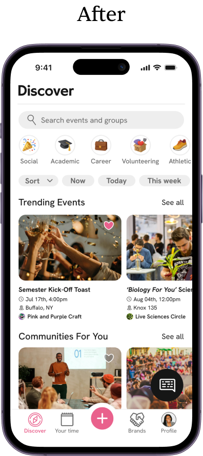
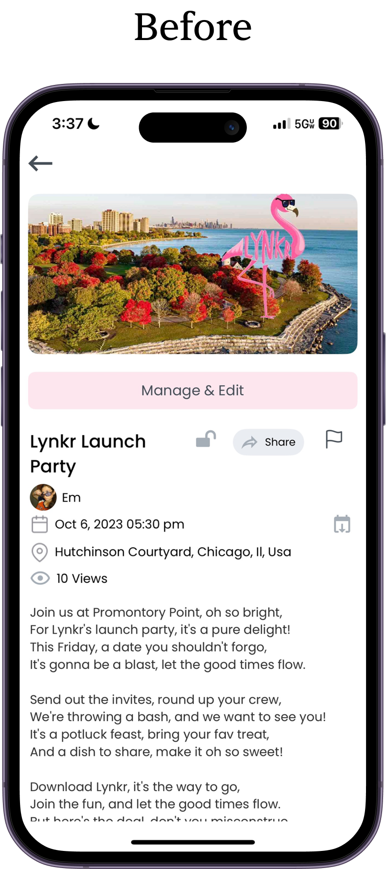
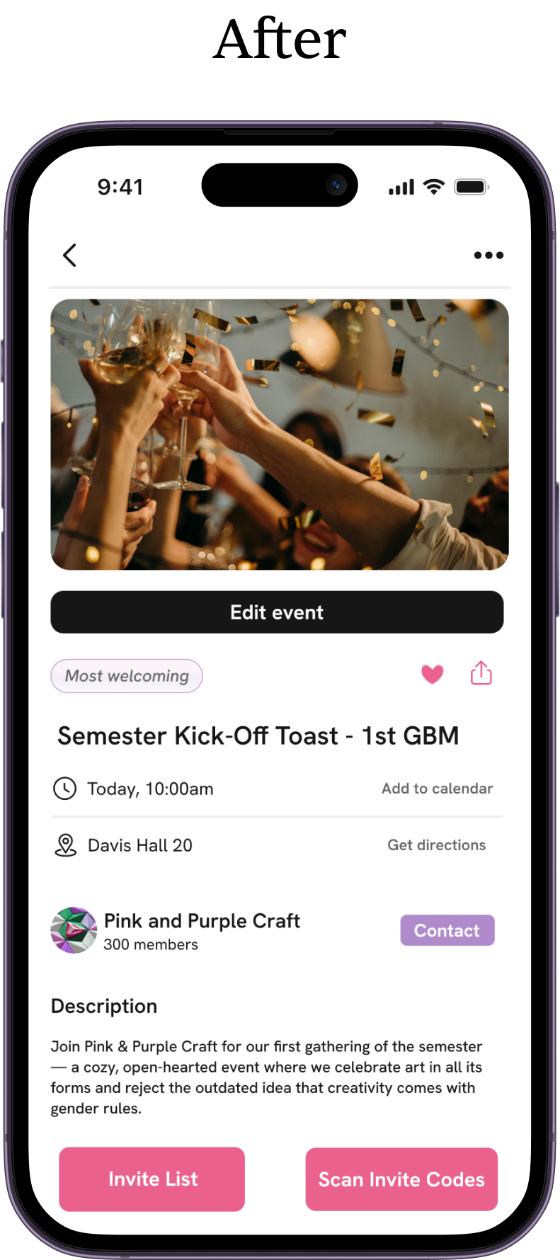
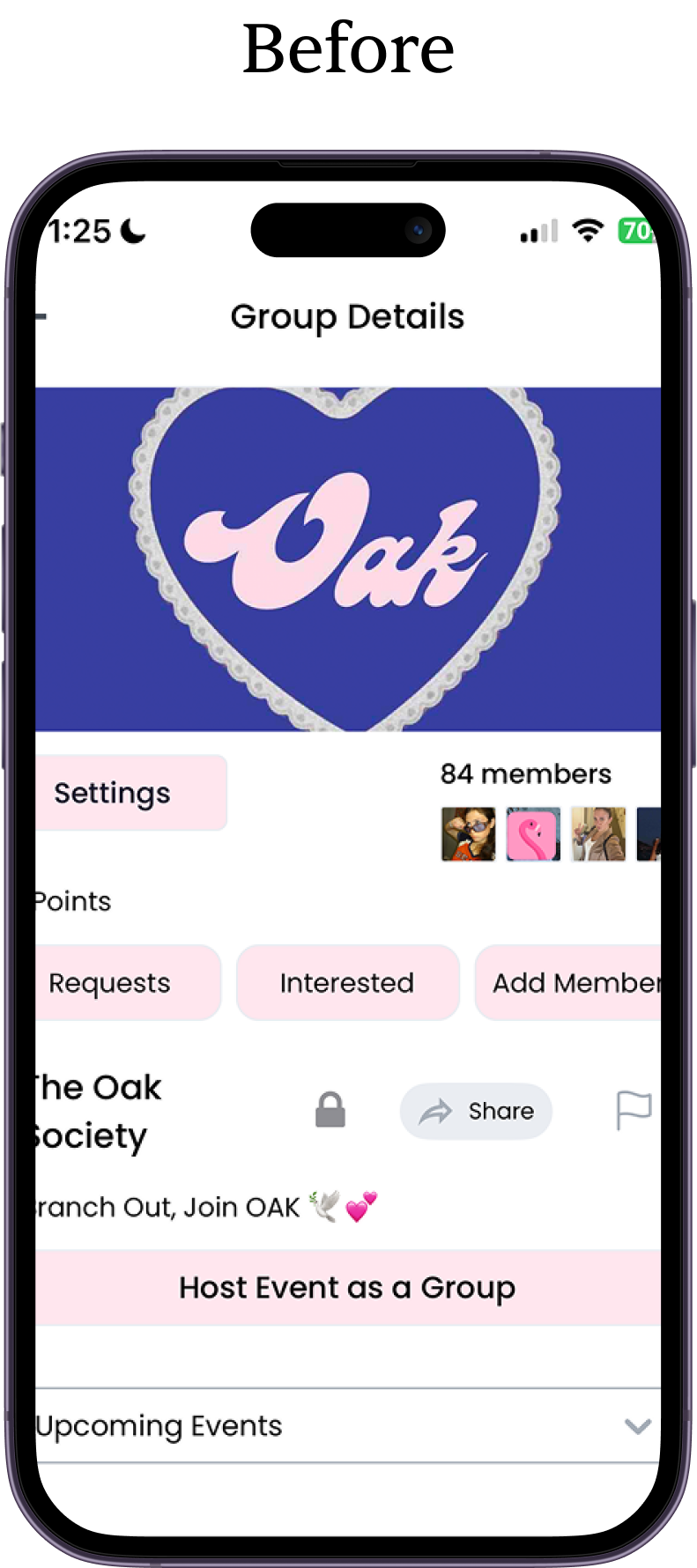
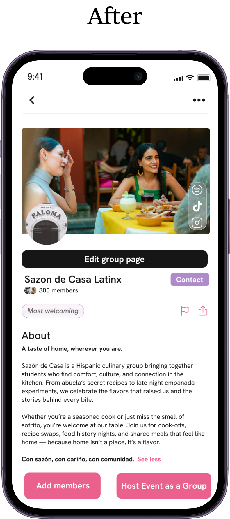
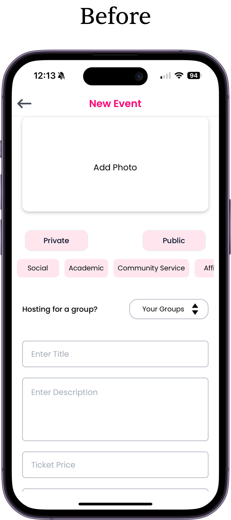
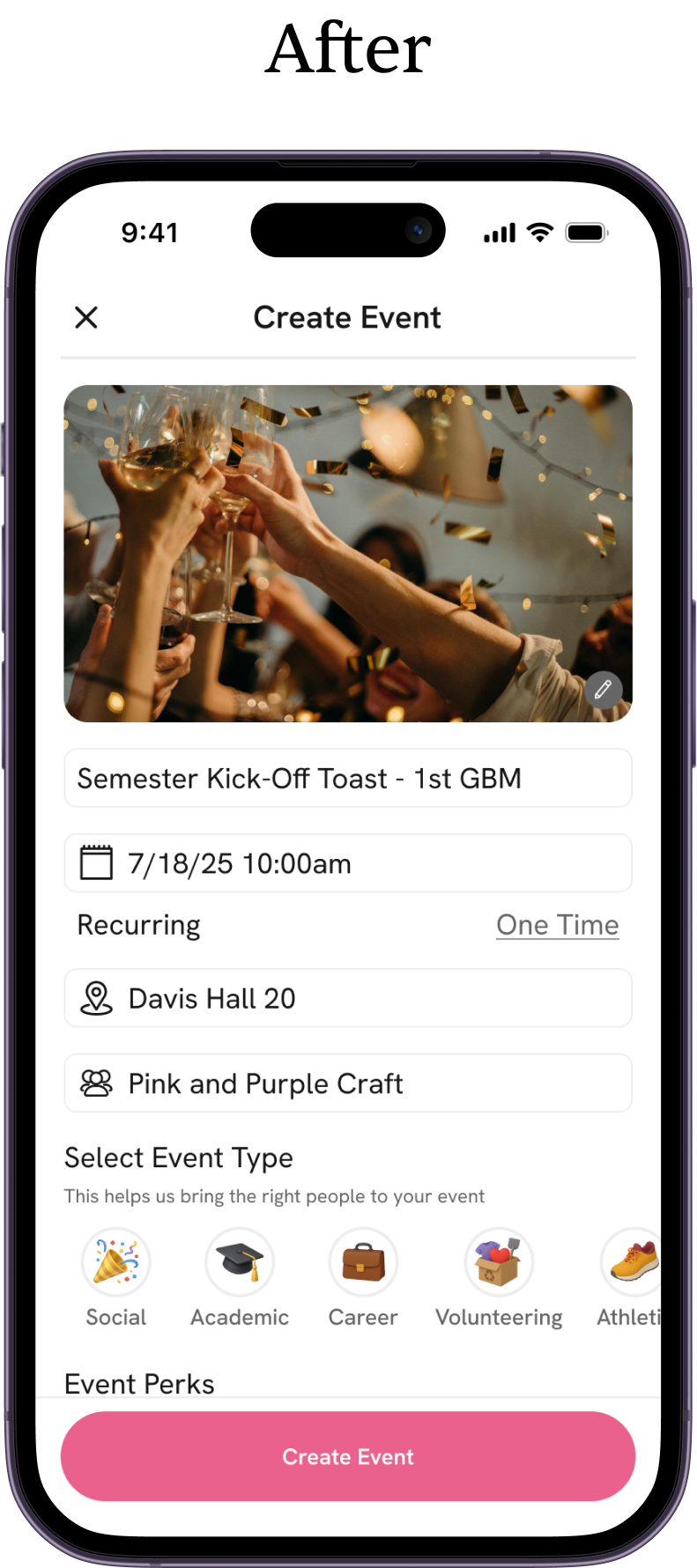
The rebrand required a complete redesign of every screen in the app. The goal was to simplify the experience and deliver a clean, intuitive interface inspired by modern apps like Airbnb. The process began with greyboxing a low-fidelity version of the app in Figma to refine user flows and layouts. Once these were finalized, we transitioned to a high-fidelity prototype incorporating the new branding. In total, we designed over 150 screens, ensuring a consistent and cohesive experience across the entire app.
Below is a before and after comparison:
Home Page
Event Page
Group Page
Create Event Page
This project not only gave me the opportunity to lead a startup through a high-impact brand transformation, but also sharpened my skills in branding, UI/UX design, and design systems. My time at Live Time was an incredible experience, and I’m proud of the work we accomplished. I’m especially grateful to my team for their support and collaboration, which made bringing this creative vision to life possible.
