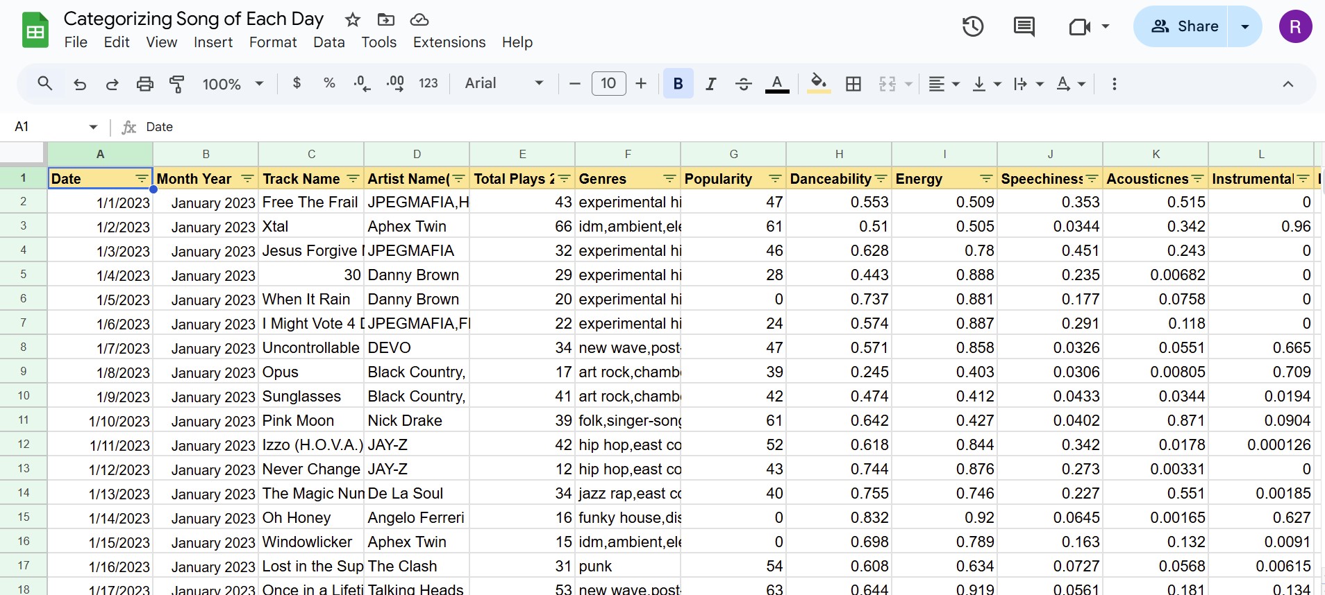
Music Taste Analysis
I listen to a lot of music, over 189,000 minutes the past two years. My passion for music runs so deep that since 2023, I’ve chosen a song every day to represent that day, adding to a growing playlist. With over 800 songs and counting, this simple ritual is something I look forward to daily, as each song holds personal significance. After learning about data visualization techniques, I thought it would be interesting to analyze my evolving music taste. Using tools like Exportify and the Last.fm API, I turned my Spotify history into a spreadsheet to uncover trends and insights over time.
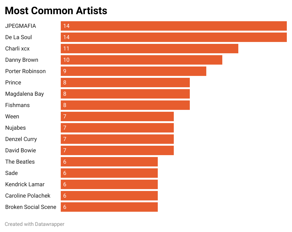
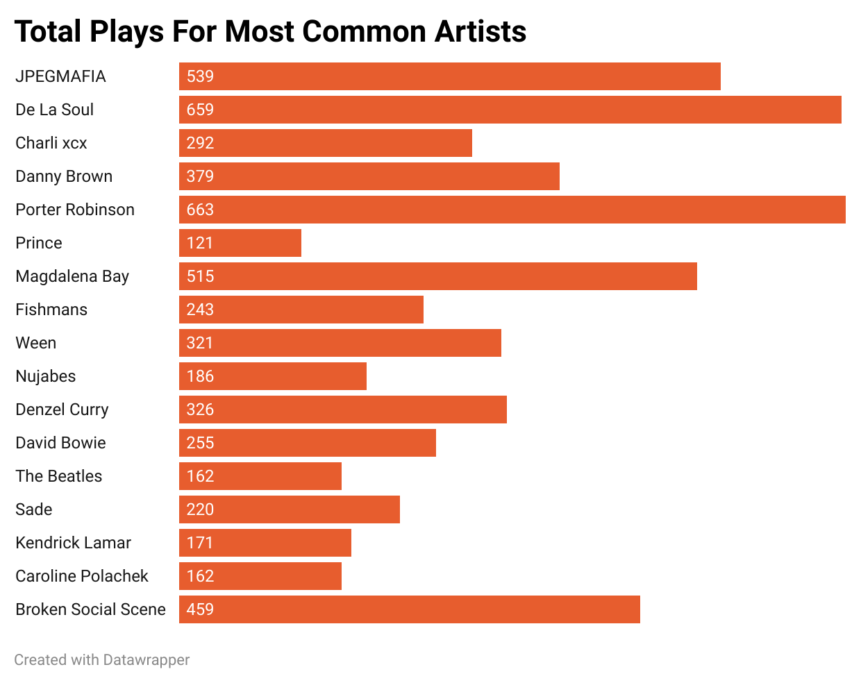
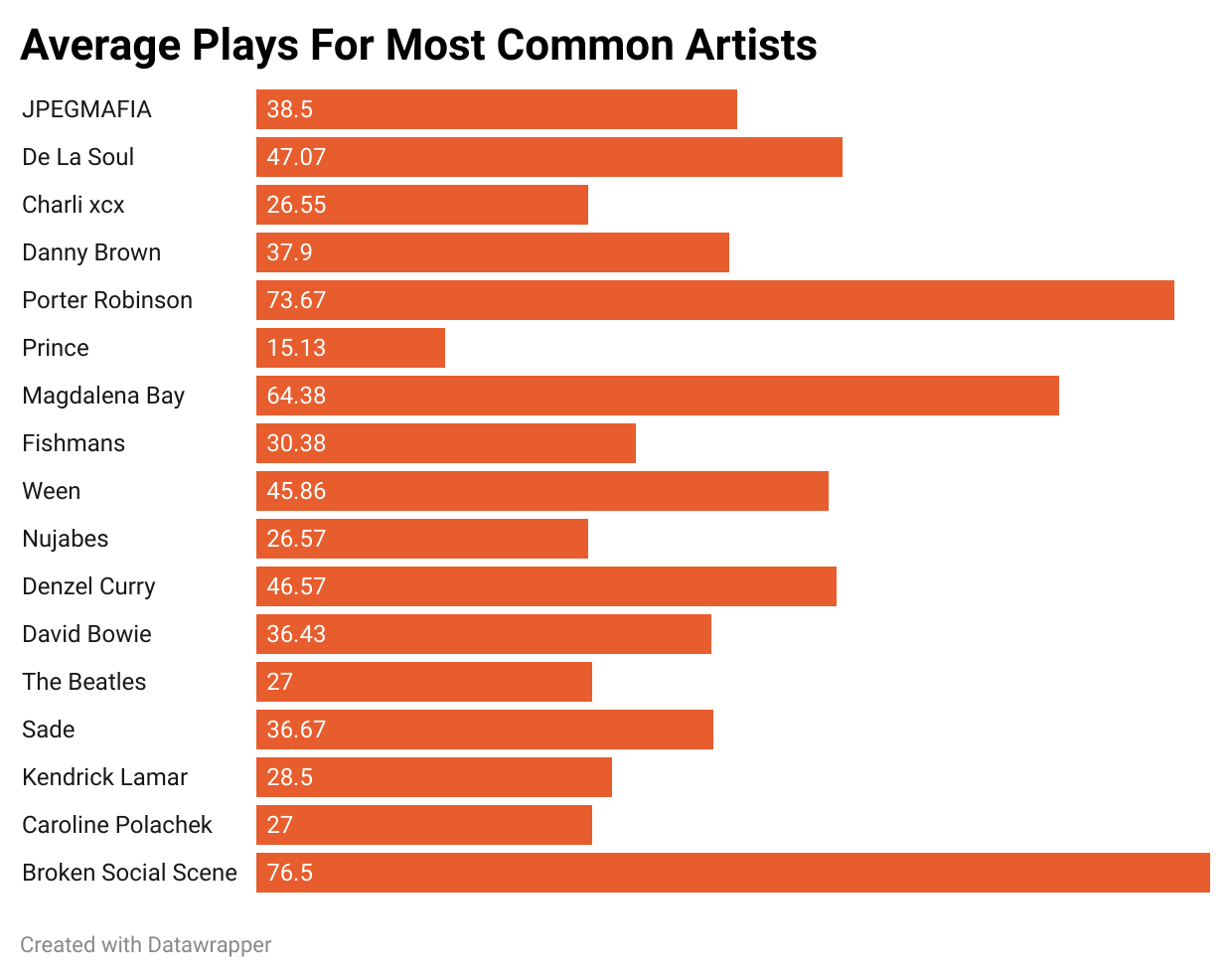
First, I analyzed the number of artists I’ve listened to, determining a total of 627 artists featured on the playlist. I then focused on the top artists, setting the cutoff at six songs.
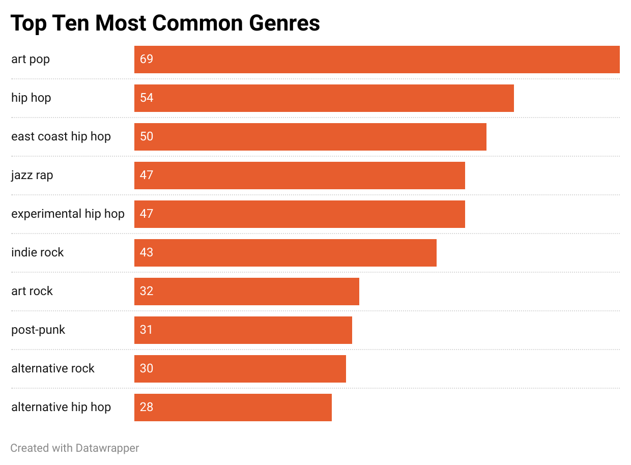
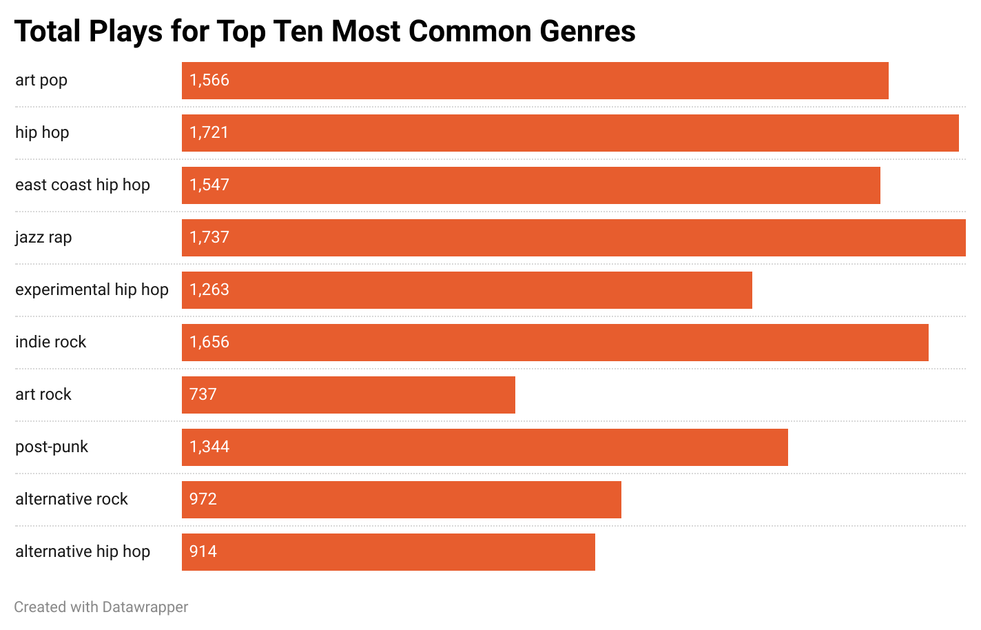
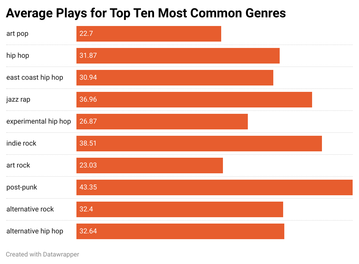
Similar to artists, I also analyzed the number of genres I’ve listened to, determining a total of 304 genres featured on the playlist. To dive deeper, I narrowed my focus to the top ten.
With so many genres in the mix, I decided to classify every song into one of 12 broad categories. Then, I calculated the percentage of each broad category for every month to track trends over time.
