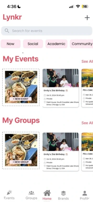
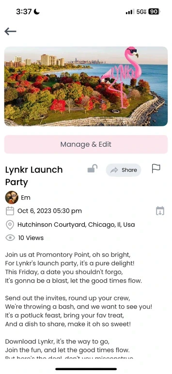
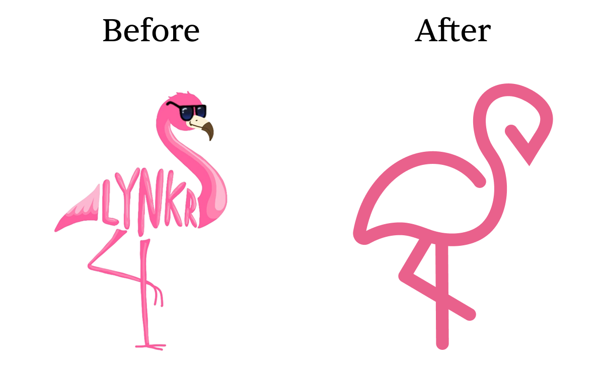
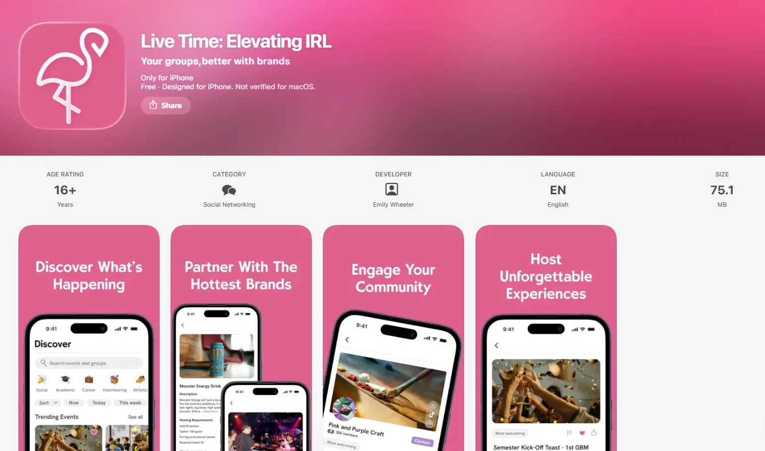
Pink was Lynkr's primary brand color, used throughout the original app. However, user feedback revealed that the original shade made the app feel overly feminine, limiting its broader appeal.
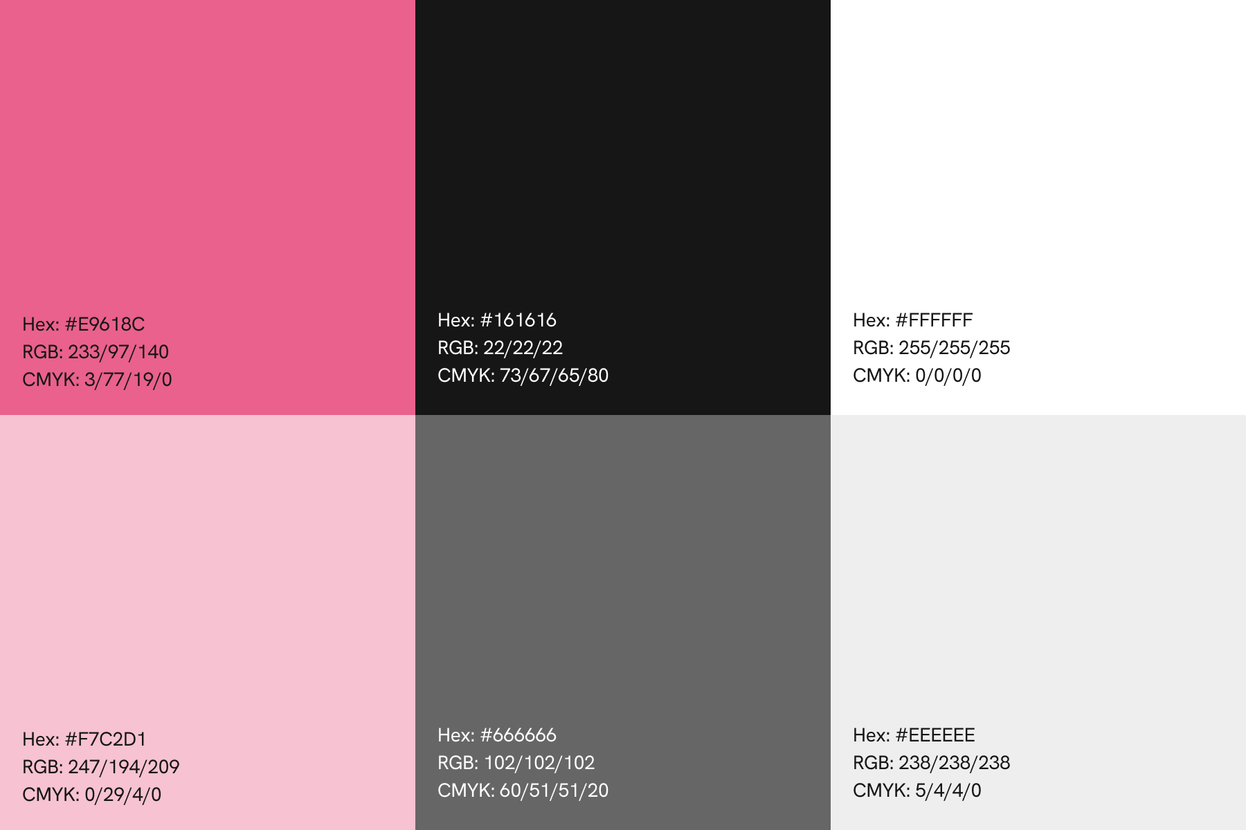
Initially, I considered replacing Live Time’s primary color, pink, but realized it gave the brand a unique identity and helped it stand out from the competition. To address user concerns, I refined the pink into a more modern and inclusive shade, pairing it with black and white to establish Live Time’s primary color palette. The new shade preserves the product’s identity without limiting its broader appeal. I also tested the palette with accessibility checkers to ensure sufficient contrast and readability.
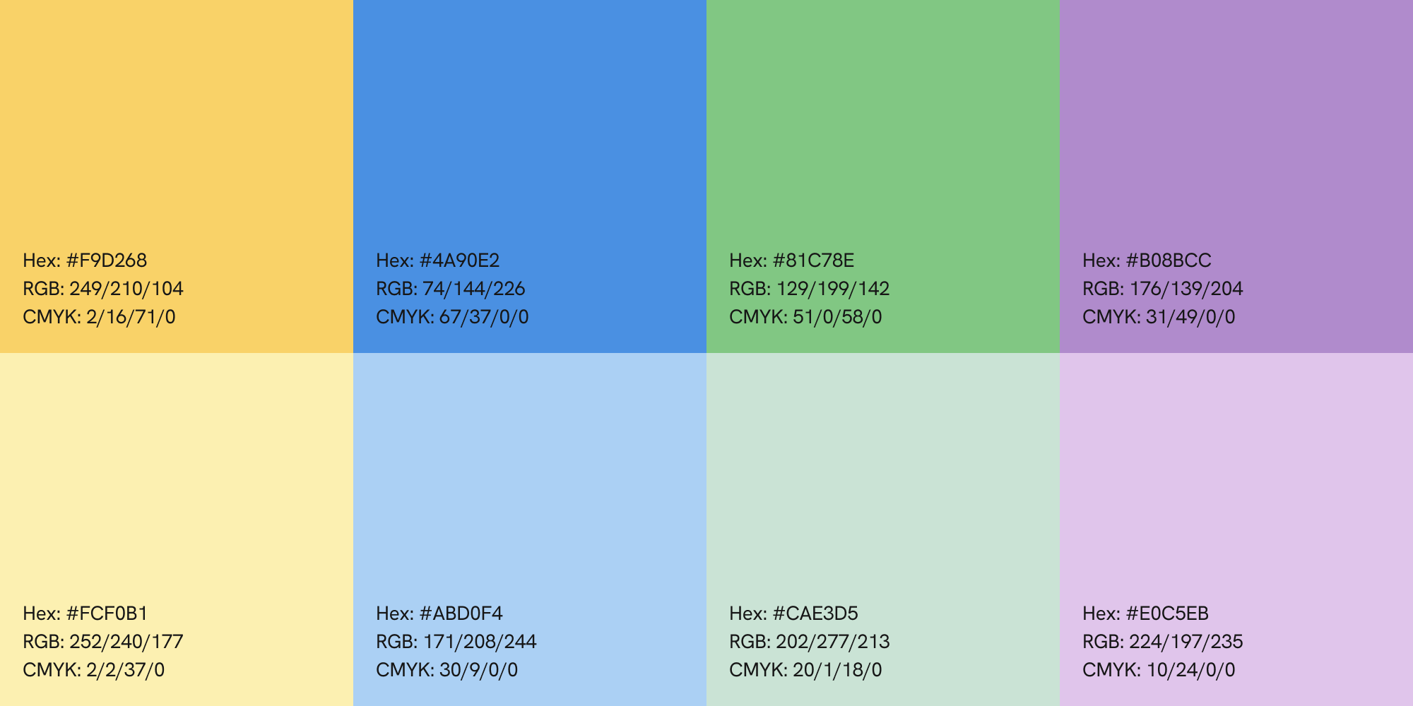
To add tonal variety, I introduced a lighter shade of pink and two complementary grays. After finalizing the primary palette, I developed five secondary colors and their lighter variations to provide greater flexibility across the app's design.
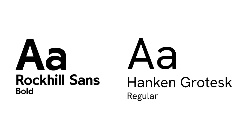
The rebrand introduced two new fonts. Previously, all text used the same sans serif font, causing titles to blend in with body copy and making hierarchy hard to establish. To fix this, I introduced Rockhill Sans as a distinct display font. Its bolder, slightly stylized shape creates clear contrast from body text while keeping the brand feeling sleek and playful. This font is used for branding and display text throughout the app.
For readability, I chose Hanken Grotesk as the primary font for all key information because of its readability, ensuring the app remains clear and easy to navigate. Compared to other sans serif fonts, I found Hanken Grotesk to feel more inviting.
The flamingo logo was retained but redesigned to align with the new modern look. The redesign, first sketched on paper and then refined in Adobe Illustrator, uses clean, simple lines to make the logo easier to recognize and even draw from memory. While the initial redesign retained the sunglasses, I found that they made the logo difficult to read at smaller sizes. The redesign is highly versatile, allowing the logo to be seamlessly incorporated into a text-based version.