
Personal Project
Love Island USA is a hugely popular reality show on Peacock where contestants spend a month on an island, isolated from the outside world, in search of love. It's an entertaining show to watch with friends, with viewers playing an active role by voting through the Love Island USA app to decide which islanders are eliminated.
The official app looks and functions poorly. It currently has a 1.9 star rating on the App Store, with reviews consistently echoing the same complaints. This is clearly a missed opportunity for Peacock. Given the app's high level of engagement, it could serve as a more effective platform for advertising, merchandise sales, and deeper audience interaction.
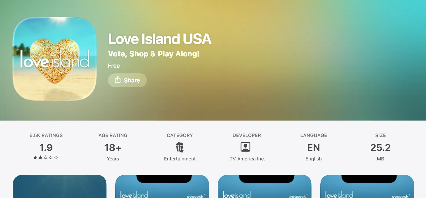
I challenged myself to redesign the official Love Island USA app, using the project as an opportunity to explore how AI tools could fit into my design workflow.
Current Version:
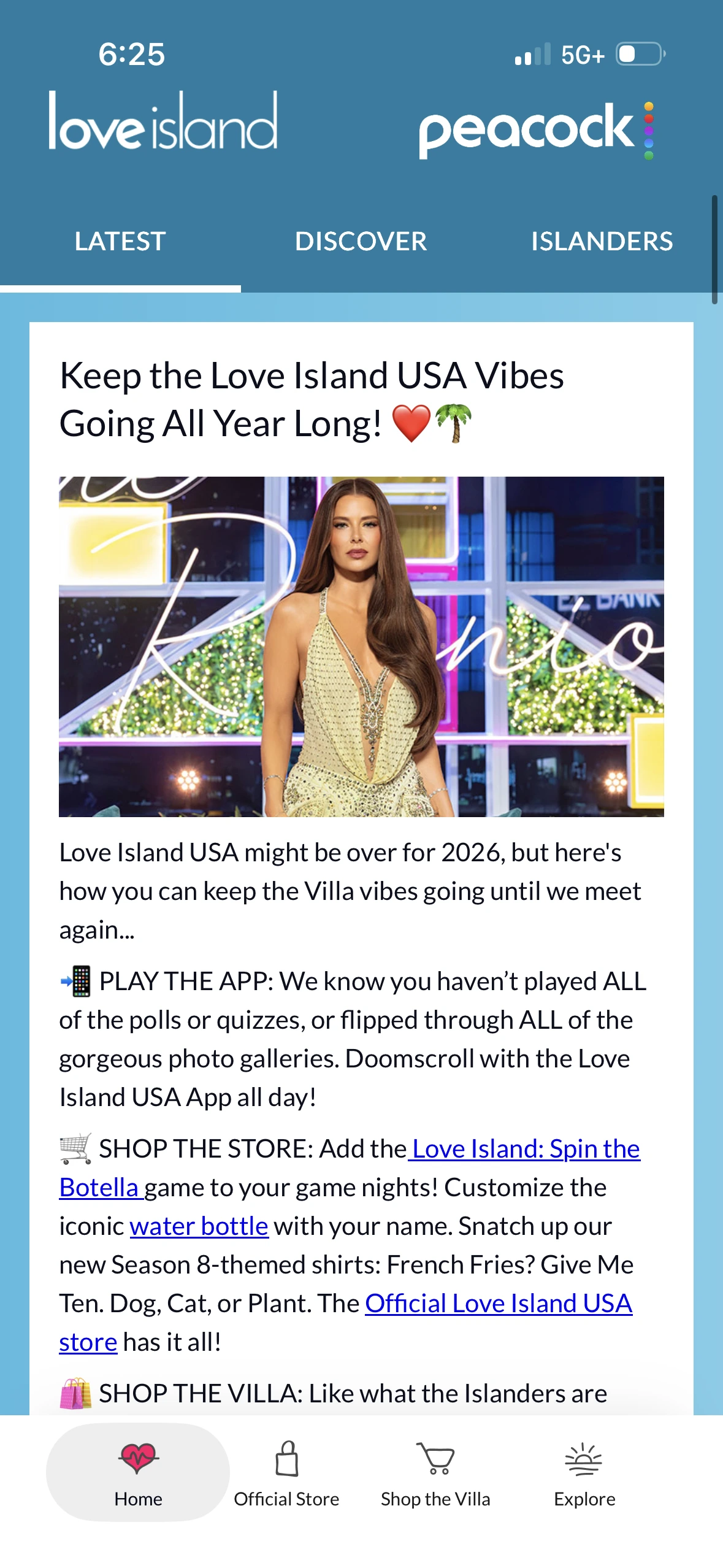
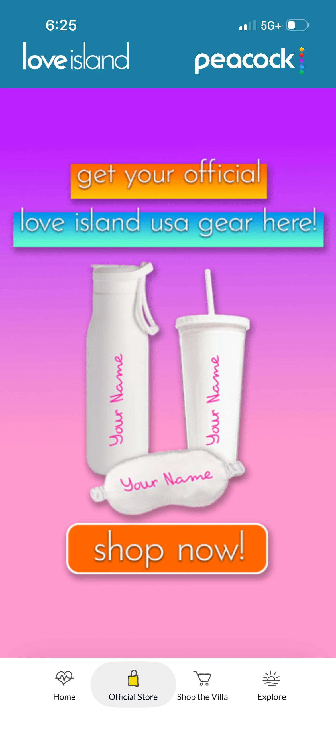
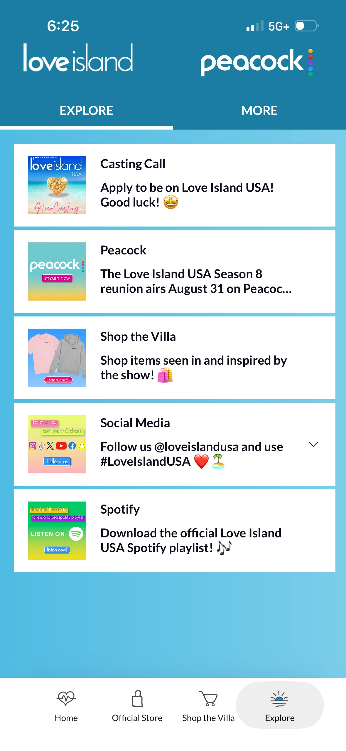
To better understand why the app is so disliked, I conducted user research with college-aged fans of the show. Their feedback revealed recurring frustrations with the overall app experience.
"It sucks and the UI is clunky."
"It looks archaic."
"I'm not inclined to do anything besides vote."
I also did my own deep dive of the app. A few issues immediately stood out:
The research highlighted a clear need to redesign the app around the needs and expectations of its fans, which led to the following question:
To help guide the ideation process, I created two personas that represented the two primary types of Love Island USA viewers identified through my research.
It was also important to consider the stakeholders' needs throughout the design process, balancing user needs with Peacock's business goals of driving revenue through advertising and merchandise sales.
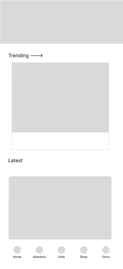
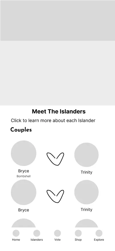
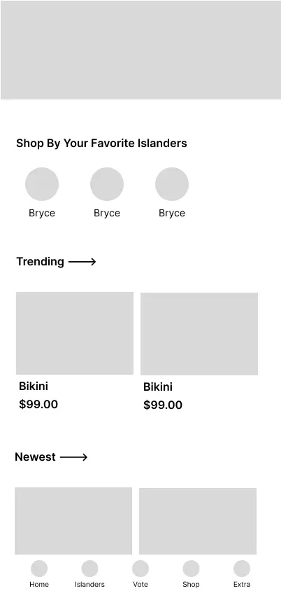
I experimented with Claude Design to generate wireframes, but it lacked context about the underlying design problem and produced layouts that didn’t reflect real user needs. It also made iteration difficult, so I created the low-fidelity wireframes in Figma instead. I then shared the wireframes with fans of the show to gather feedback on the layout and incorporated their input into the next design iteration.
Next, I built the design system, pulling colors and typography directly from the show’s branding. Claude Code helped me expand the system quickly, handling simple components like buttons and text fields well. It struggled with more complex components, such as cards, so I designed those myself.
Once the design system was finalized, I progressed to high-fidelity designs. To speed up the process, I used Claude Code to generate an initial pass based on my low-fidelity wireframes and design system, then refined the designs to match my vision.
For the new Home Screen, I adopted the card-based feed pattern used by apps like X and Instagram because it is familiar and easy to scan. I chose this layout because Love Island USA fans already use these platforms to engage with content from the show.
Added a new Islanders page to the navigation bar. This helps casual fans keep track of who is coupled up and who is still in the villa, while giving superfans quick access to their favorite contestants’ social media. I selected a dedicated page over a side section because the Islanders are central to the show and this information deserves top-level visibility.
Voting flow was cut from 5 clicks to 4, reducing friction. I also added a confirmation button to submit voting decisions, since users could previously misclick and vote for the wrong contestant.
Added a Shop page to encourage browsing. The layout was modeled after Airbnb because of its proven pattern for displaying information. I decided not to implement a full purchase flow because it did not fit the scope of the project. Instead, having users tap on items for sale to be redirected to Peacock’s website felt like a more practical approach.
Refined the Extras page to improve its visual hierarchy, since all information previously had equal visual weight. Now users can easily find key information, like the official Spotify playlist, while secondary details like settings are condensed.
AI is most effective with clear direction. Providing specific instructions and concrete references accelerated execution and produced results closer to my vision, though I still needed to refine the work to arrive at the final design.
